Containers
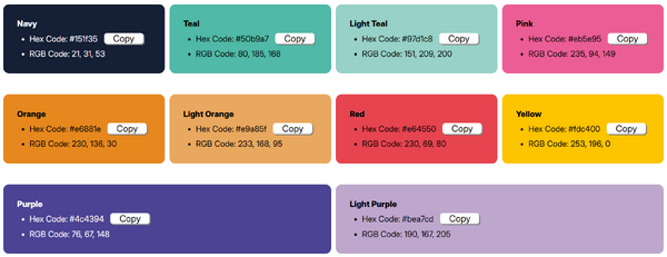
The container is a flexible coloured box that by default is used on the welcome messages you see on guides. It can contain multiple different elements and can be viewed in multiple different colours.
Example Image

Adding a container
You can add these containers by first creating a 'div' and assigning the class 'container-wu'. Further utilities and colours can be applied as you see fit.
Example Code
<div class="container-wu">
    <h3>This is the main heading</h3>
    <p>This is sub text</p>
</div>
What it looks like:

Hmm... missing a bit of colour isn't it? Well this is where these utilities and colour classes come into affect.
Adding colour
To add colour, simply add the colour to the end of the class list. For example: 'container-wu navy'.
light-teal, Purple would become purple, etc.Utilities
Utilities are extra classes that can manipulate the element in a variety of ways without you having to memorise code / use inline CSS styling, think of them as individual tools in your toolbox that help with different tasks of a DIY project.
Center
By default, as you saw in the example above, the main paragraph / body text is aligned to the left, whereas in the welcome message it is usually center aligned, this is where the first utility comes into play, literally called 'center'.
By once again adding this to the end of the class list, all of the text in the container will be center aligned.
All utilities can be combined with the colours.
For example: 'container-wu navy center'.
What it looks like:

Slim
By default the container box is meant to be quite large with a lot of padding / spacing around it, however, perhaps you want to use the container as a heading for example and don't want to use such a thick container, well that's where 'slim' comes into play.
What it looks like:

