Buttons
The button is a stylised link in disguise. Creating a button requires creating a standard link ('a' tag), and adding a class to it.
Example Image

Adding a button
You can add these buttons by first creating a link 'a' and assigning the class 'btn-wu'. Further utilities and colours can be applied as you see fit.
Example Code
<a href="https://example.com" class="btn-wu">Visit Example.com</a>
What it looks like:

Hmm... missing a bit of colour isn't it? Well this is where these utilities and colour classes come into affect.
Adding colour
To add colour, simply add the colour to the end of the class list. For example: 'btn-wu navy'.
light-teal, Purple would become purple, etc.Utilities
Utilities are extra classes that can manipulate the element in a variety of ways without you having to memorise code / use inline CSS styling, think of them as individual tools in your toolbox that help with different tasks of a DIY project.
All utilities can be combined with the colours and multiple utilities can also be added, you are not limited to just 1.
For example: 'container-wu navy active wide zoom'.
Active
Adding the 'active' class will add a dark green highlight (border) around a button to show the button is 'active'.
Example Code:
<a class="btn-wu active">Mac OS Guidance</a>
What it looks like:

Wide
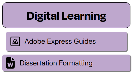
Sometimes depending on the layout of a guide, you may find a button doesn't quite stretch as wide as you would like, by using the 'wide' class, you can force the button to stretch to 100% width.
In the example image below you will find the button on top to be the default button that doesn't quite stretch the full width of the heading, and the button below has the 'wide' class added so it does stretch to 100%.
What it looks like:

Zoom
All of the buttons added to the site have a subtle push in and pop out effect, this is created by the 'zoom' class which adds this subtle animation to the buttons.
It's not a requirement to add it, but it is highly recommended as it helps visually show the user feedback from the button they hover over.
What it looks like:

